
You’ve probably fallen victim to a Dark Pattern lurking around the internet. They tend to troll every popular website and app you can imagine. Websites hire skilled designers to sneak Dark Patterns into websites to look attractive.
Don’t just take my word for it, though..
Researchers found that 95% of popular Android apps use Dark Patterns. Another study showed that 1 in 10 websites use Dark Patterns.
Let’s start by defining what we’re up against.
What Are Dark Patterns?
Dark Patterns are sneaky little tricks unscrupulous designers use in websites and apps to make you do things you didn’t mean to. In other words, designers and the companies behind them try to nickel and dime you. It’s an easy – even if shady – way to manipulate you into paying more, opting in for tracking, subscribing to newsletters, or even giving your private information away. In the long run, companies only stand to profit off of Dark Patterns.
The concept isn’t entirely new. The retail sector has used deceptive practices, nudging, and growth hacking to manipulate user behavior for decades. How often have you seen prices like $299? Why not just put the price at $300? That’s deceptive pricing.
Dark Patterns are so widely used that, to some extent, they’ve become industry standards. The worst part is that some big-name websites have been caught using them. Hotmail, LinkedIn, Apple, Robinhood app, to name a few.
The Aim?
Websites and designers turn to Dark Patterns for three main reasons: money, data, and addiction.
- Money Money Money
From client retention to reaching quarterly sales targets, businesses use Dark Patterns to generate profits. They may get you to subscribe to a service by mistake and then make it difficult to unsubscribe. That way, they keep you paying for longer.
Websites also try to get you to make a purchase that you didn’t intend to do. They sometimes subtly add items to your cart, say insurance.
- Data
Dark Patterns also gather data and track you. A paper recently showed that less than 1% of users provide informed consent when prompted to accept tracking. Websites use this knowledge and employ Dark Patterns to trick you to opt-in.
- Addiction
Addicted people are easy to control. If you’re addicted to an app, you’ll most probably buy more, give access to more personal information, and see more ads. It feeds back to both reasons mentioned above.
Why Are Dark Patterns So Successful?
Dark Patterns have been a successful way for websites to meet their goals for two reasons.
- Skimmers
Are you like me trying to get to the end of an article in a few seconds? That’s what website users are assumed to do, so websites use Dark Patterns to trick you. You’d think it’s saying one thing while it says something else.
- FOMO
Websites exploit your fear of missing out (FOMO) to push you to make decisions without thinking them through. If you get an offer with a countdown timer, you’ll react hastily. It’s a click-or-lose scenario with click winning.
To avoid being a victim of Dark Patterns, you need to know what they are.
Dark Pattern Types
As most masters in the art of deceiving will tell you, you have many ways to manipulate someone. Many fine tips and tricks exist when it comes to deceiving people. In 2010, Harry Brignull gave each type a provocative name so you could remember them.
Here, I’ve outlined many different Dark Pattern types and how they can deceive you.
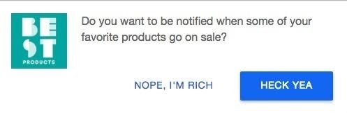
1. Tricky Questions
Designers craft this Dark Pattern to confuse you into doing something you might not normally do.They can do this by using different language artifices, like:
-
-
-
-
- intricate wording
- double negatives
- words with double meaning
-
-
-
Notice in Figure 2 an application. You might assume that by not clicking you’re opting-out of commercial offers. Instead, if you read through, you notice you end up doing the exact opposite.

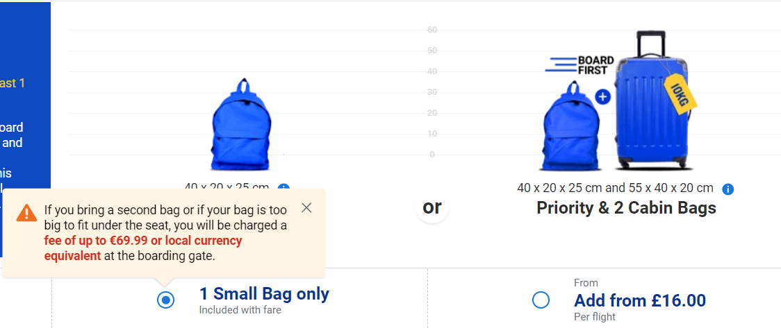
2. Sneaking Items into the Basket
The website sneaks other items in your cart as you purchase without your knowledge or consent. It could also go to extremes to inflate the prices in your cart, hoping you won’t notice.
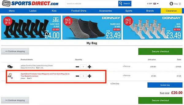
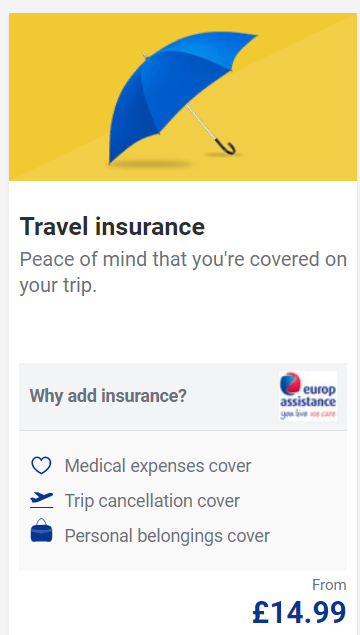
If that doesn’t fly by, they try to trick you into adding items to the basket. Here’s an example. When booking a flight, you get the option to add a larger cabin bag. Do you notice the extra fees? When I clicked on the bag included in the fare, I got a warning message that if my bag ends up bigger I’ll pay much more than the £16.00 they offer now.
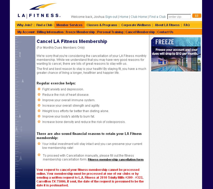
3. Roach Motel
Ever seen Men in Black? Roaches don’t go away easily. That’s the idea behind the so-called Roach Motel model. When you opt-in, it’s tough to opt-out. Why would anyone want to be a roach? Human nature. We’re always in a battle against malicious, online money-driven incentives where greed gets you to:
-
-
-
-
- sign up for a newsletter
- register with an account
- click on links or watch ads
- opt-in for data-mining
- agree to a paid subscription
-
-
-
Take the example below. You probably subscribed to the club membership online. To cancel the subscription, you’ll first have to read through why you shouldn’t. Then, you’ll have to go to one of their club locations or send a written request. At this point, I’d start thinking “what a hassle…maybe it’s easier to stay subscribed”.
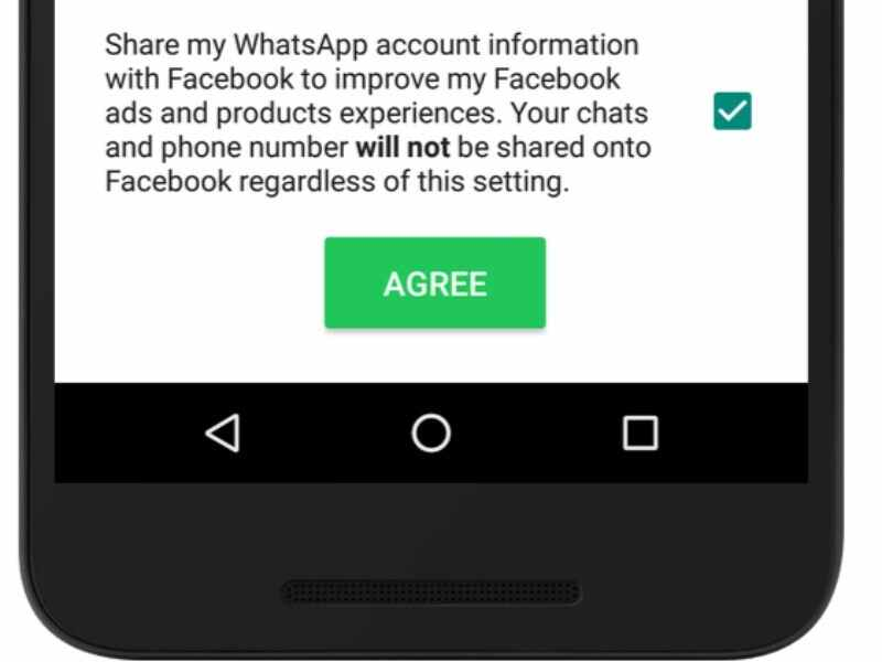
4. Privacy Zuckering
Agree to Terms and Conditions, do you?
How often do you press agree without even reading the terms and conditions? That’s when you give the website or app access to your data and the ability to share it with third parties.
Take the WhatsApp privacy update as an example. You only fully realise what you’re consenting to when you press the “read more” button.
5. Price Comparison Prevention
Comparing apples to oranges! That’s exactly what websites do. They confuse you so you can’t make a cost-efficient choice.
Here’s an example from LinkedIn. They give you a premium plan selection but none has a price. Perhaps you plan to “Hire” a talent. That said, if you register as a “Business” account it would be cheaper. You don’t get that choice!

6. Confirmshaming
Confirmshaming refers to ads, newsletters, or pop-ups that try to guilt you out of clicking the negative option.
The option to decline is worded in a way that makes you feel ashamed if you don’t accept.
The classic “No, thanks” option turns into “No, I don’t want to save money” or “No, I already know everything”.
7. Intentional Misdirection
Websites use this Dark Pattern to direct you to a pricier option than the basic option you’re choosing. Many airline websites have used this trick.
Ryanair is a good example. They used to ask you to select your country. That meant adding insurance to your bill. You could opt-out by selecting the phrase from the list of countries. If you noticed it!
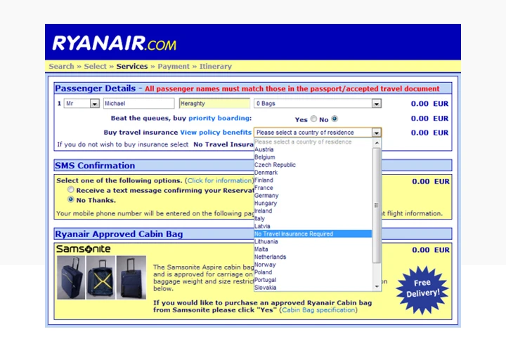
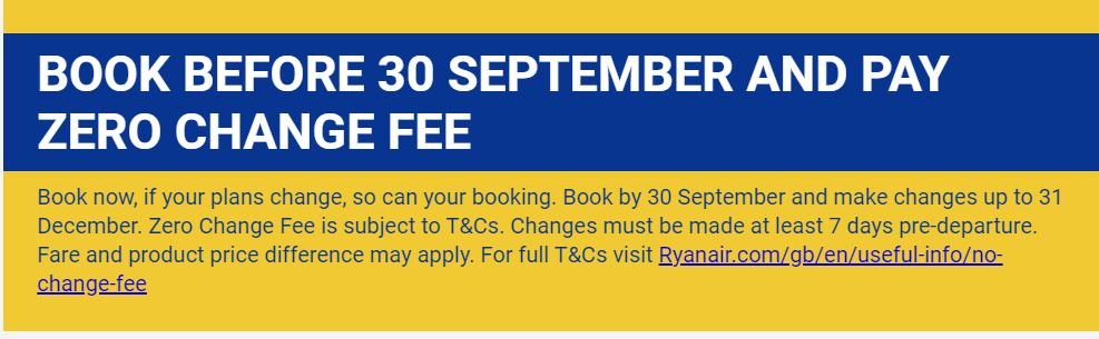
Figure 10 shows another example from Ryanair. At first glance, the zero change fee may seem like a bargain. If you read the paragraph below, though, you find a series of restrictions to benefit from the zero change fee offer.
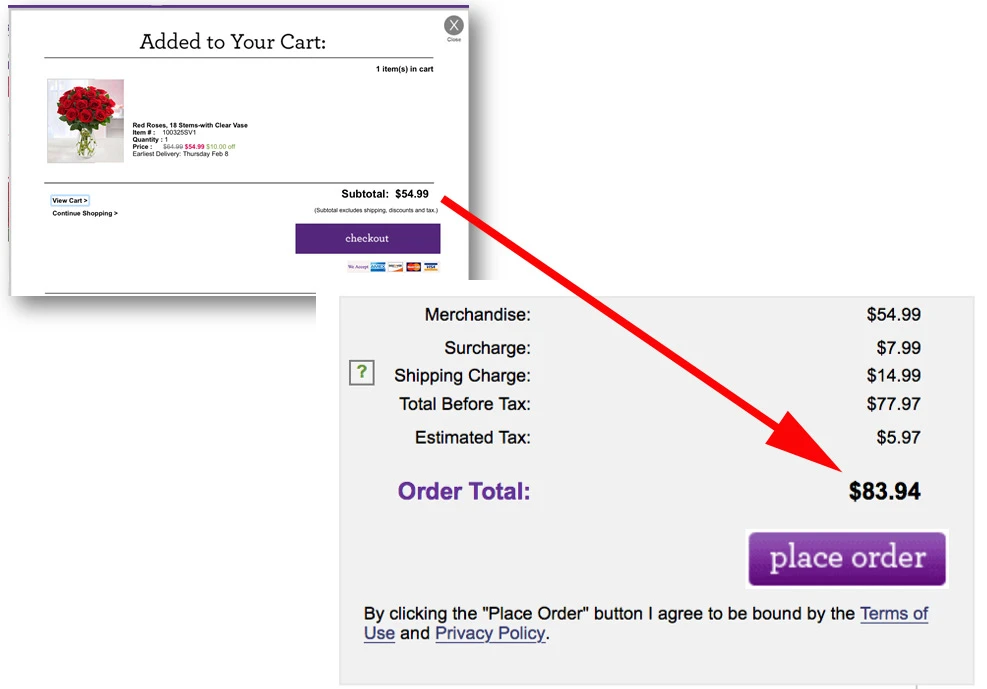
8. Hidden Costs
You’ve added your wish list to your cart. You’ve reached the last step of the checkout process. But wait. What are those extra charges on the invoice?
These can be delivery fees, care fees, handling charges, or tax fees.
When these costs pop up at checkout, it’s frustrating.
You could easily miss them. You’ve probably missed them before!
9. Bait and Switch
This design revolves around surprising you – and not in a good way.
It’s when you do one action and an unintended outcome happens.
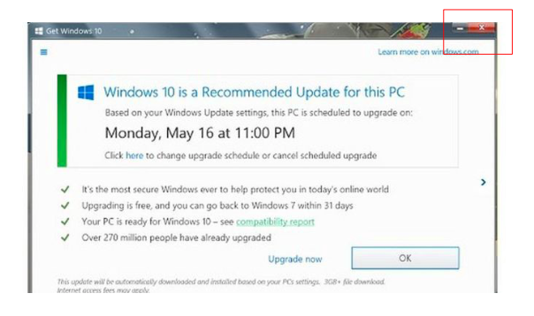
The most infamous example was back in 2016. Microsoft misguided people into upgrading their computers to Windows 10. They changed the typical “X” which has meant “close” for decades, to mean “Yes, I want to upgrade to Windows 10”.
10. Disguised Ads
Online ads could be action buttons disguised to look like part of the web page design. Websites will often run advertisements that look like a “download” or a “read more” button. The design can trick you into clicking these buttons to get to the desired content. In many cases, you might not even notice you’re leaving the website you were on initially. Instead of getting what you want, you’re redirected to another website.
11. Forced Continuity
“Join for free” followed by “enter your card details”. If it’s for free, why should I enter my card details?
Most often, after the trial period ends, the company bills your credit card for the service without notice.
When you eventually notice these charges, the company makes it extremely difficult for you to cancel your subscription.
Companies bargain that if it takes too long maybe you’ll give up and keep your subscription. They also aim to benefit from the charges you’re still paying until your subscription gets cancelled.
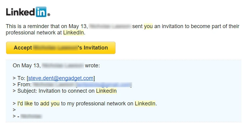
12. Friend Spam
How often do websites or apps ask for permission to access your email or social media accounts? Instead of using your contact details to connect you with your friends, the website uses them to spam your contacts.
Even worse, the messages that reach your friends will often impersonate you. LinkedIn used this in 2015 and got a $13 million fine.
You’ve made huge progress by now to know how to stay away from Dark Patterns. To take it a step further, let’s check what regulations protect you and the actions you can take?
Pulling the Plug on Dark Patterns
Protected by Law
You have to know your rights to claim them. Gladly, regulations do protect you. If you live in California or Europe, the California Consumer Privacy Act (CCPA) and the General Data Protection Regulation (GDPR) protect you.
1. CCPA
In March 2021, California’s Office of Administrative Law approved new regulations that will prohibit websites from using Dark Patterns. California is the first state to decide to ban Dark Patterns.
Here are the criteria websites will have to meet.
-
-
-
-
- Companies can no longer choose consumer groups for behavioral experiments unless the companies get informed consent
- All communication letters, emails, newsletters, etc. need to use clear and concise language
- Privacy settings need to be clearly visible and accessible to users
- Privacy settings need to be written in plain language
- Users should be able to easily opt-in or opt-out of tracking
- Users must explicitly consent to having their data processed, sold, or shared
-
-
-
As of May 2021, legislation is still underway to further tighten data collection disclosures.
All this paves the way for other states to take action. Washington state senators, for example, introduced a similar bill earlier in 2021.I’ll keep you updated on this as I learn more.
2. GDPR
The criteria are similar to those of the CCPA. The regulation also sets very high fines. The maximum fine can reach €20 million or 4% of a company’s global revenues. That excludes what they have to pay if you choose to seek compensation for damages.
As for users outside these areas, we wait to see how their regulatory bodies take action to protect privacy. For now, they might have to take the issue up themselves.
Taking Things into Your Own Hands
If you still find Dark Patterns, you can do one of two things.
1. Shame them
You can take a screenshot of the Dark Pattern and tweet it to #darkpatterns or retweet #darkpatterns you see. This may influence companies and lead them to change their design.
Maybe you’re thinking what can one person do? Can this really make a difference?
Yes, it can. Remember, the Ryanair insurance example I mentioned before. I guess Ryanair has been under massive scrutiny and they eventually removed that Dark Pattern.
I did a test on their website to double check. Now, it’s very clearly laid out. They give you the option to buy insurance or not.
2. Report them
The Dark Pattern Tip Line is there for that purpose. On the “Harms” page, you can submit a case. They set seven categories for you to choose from. You also have the “Sightings” page. There, you’ll see cases that happened with users like you.
The Bottom Line
Dark Patterns are tricky, but you can win. We’ve seen how much thought designers put into creating these patterns to trick you. Websites and apps can use these widespread types interchangeably or all together to maximize benefit.
Unfortunately, websites and designers often succeed in using Dark Patterns to siphon off your loose change.
Who are they? No one.
Knowledge is power. I suggest educating yourself on the different types of Dark Patterns to gain better control over your browsing experience.
Then, go ahead – shame and report these cyberthieves!
Have you ever dealt with any Dark Patterns? Let me know in the comments below. Better yet, take a screenshot of a Dark Pattern you’ve seen recently and post it in the comments.
Until next time, stay safe and secure!
Leave a comment